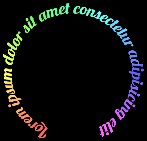
There is no simple and obvious way to set text on a circle in CSS. Good news though! You can create a beautiful, colorful, and even rotating circular text with pure CSS. It just takes a bit of work and we’ll go over that here.
Circular-set text can be used as a decorative element, a cool headline, wrapping a call-to-action button, a loading animation, and really anything else you can think of.
This whole concept of circular text is not new. I encountered a few articles and videos about it over the years, starting with Chris Coyier’s article from way back in 2012, up until this article by Jhey Tompkins from last year that shows a great use of CSS trig functions. Both of them, and others, use a very similar method: splitting the text into individual characters, then rotating these characters around a common center. Like Chris shows in his article:
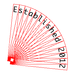
While it does work, and looks great, it limits us to using a monospace font. Otherwise, the characters start to overlap each other, it doesn’t look as good, and the text can be unreadable. But I’ve never liked this limitation (or limitations in general to be honest), so we’re going to look at a completely different method that allows us to use any font we want, not necessarily monospace, including weird cursive fonts, and even emojis. And hopefully we can learn a new thing or two along the way, so let’s begin!
In order to get the desired result, we will divide our work into three steps.
Step 1) Splitting
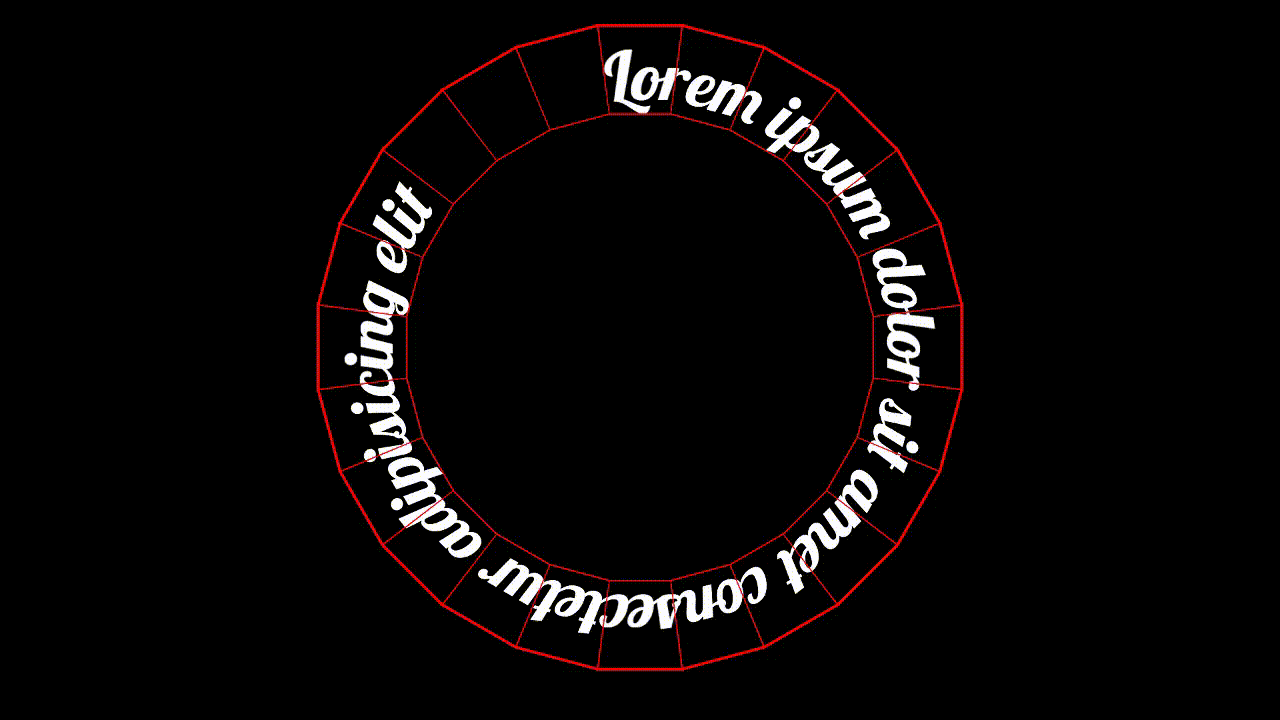
As I said, up until now, people tended to split the text into individual characters (e.g. Splitting.js), but now we’re actually going to split the text into equal width segments (using <span> elements) and each segment will have a visual piece of the final text. In order to do that we will add a number of span elements into our text container, each containing the desired text (please read the accessibility note at the end of this part).
In the example we’re building toward here I’m using 24 <span>s, but the number of segments is up to you. The more segments you use the better it will look, just don’t use too much as it might affect performance, especially if you’re going to animate the text.
<div class="textContainer">
  <span style="--i: 0;">Lorem ipsum dolor sit amet consectetur adipisicing elit</span>
  <span style="--i: 1;">Lorem ipsum dolor sit amet consectetur adipisicing elit</span>
  <span style="--i: 2;">Lorem ipsum dolor sit amet consectetur adipisicing elit</span>
  <!-- add more spans -->
</div>
Code language: HTML, XML (xml)
As you can see, I’ve also added a style attribute to each span and inline a custom property of --i with an ascending value. We will use this value later on to position each segment.
For the CSS, let’s set the font-size to something a bit bigger, say 60px, and we’re going to set the width of each span to 1em. Next, we want to keep the text in one line so we’ll add white-space of nowrap, and set the inner position of each text using text-indent with a simple calc function in it of the --i custom property times -1em (the width). And the last thing, to keep everything inside the span, we will use overflow: hidden.
We’re going to add two more things (just temporarily, so we can see things better): a display of inline-block as the default display of a span is inline, and some of the properties we set don’t work on inline elements. And we will add an outline for each span to see they’re outline.
.textContainer {
  span {
    width: 1em;
    font-size: 60px;
    white-space: nowrap;
    text-indent: calc(var(--i) * -1em);
    overflow: hidden;

    /* temporarily */
    display: inline-block;
    outline: 2px solid red;
  }
}Code language: CSS (css)
And this is the result so far:
As you can see, we ended up with a bunch of red rectangles, each containing a continuous segment of the text. I’m also using the well-known Lobster font here, as it is cursive, and I kind of like it, so why not.
Please note that this is not accessible! If we leave it as is, screen readers will read the text repeatedly for each span. This is not good, so in order to avoid it, I’ve added the aria-hidden attribute on the text container. If you wanted the text to be read by screen readers (once), you could add aria-hidden to all but the first one.
Step 2) Positioning
Our next step, similarly to monospace font techniques, is to position these segments in a circle. This positioning will be done using transform, but first let’s add a position: absolute to each segment, and a position: relative to the .textContainer as the main context for the positioning.
On the transform property we’re going to need to add a few things. First, we want to center these elements so we’ll add a translate of -50% on each axis. Now we need to rotate each span, and the angle of the rotation depends on the number of elements we are using. Here, because we are using 24 elements, the rotation for each element will be 360° divided by 24, that is 15°.
360° ÷ 24 Segments = 15° per Segment
So we’ll add a rotate with a calc function of 15deg times the --i custom property. Now we can translate each element again, moving it upwards (on the y-axis), and to figure out exactly how much we need to move it. We’re going to use some basic math functions here:
.textContainer {
  position: relative;

  span {
    position: absolute;
    transform:
      translate(-50%, -50%)
      rotate(calc(15deg * var(--i)))
      translateY(calc(-1em / sin(15deg)));
  }
}Code language: JavaScript (javascript)
Now let’s add this code to what we already have (note that we don’t need the display: inline-block anymore as we are using position: absolute on the span), and what we get is a nice circle of partially overlapping segments.
If we take a closer look at how these segments are touching each other, we can see that the segments are overlapping at the bottom (the inner side of the circle), and are far away from each other on the top (the outer side of the circle).
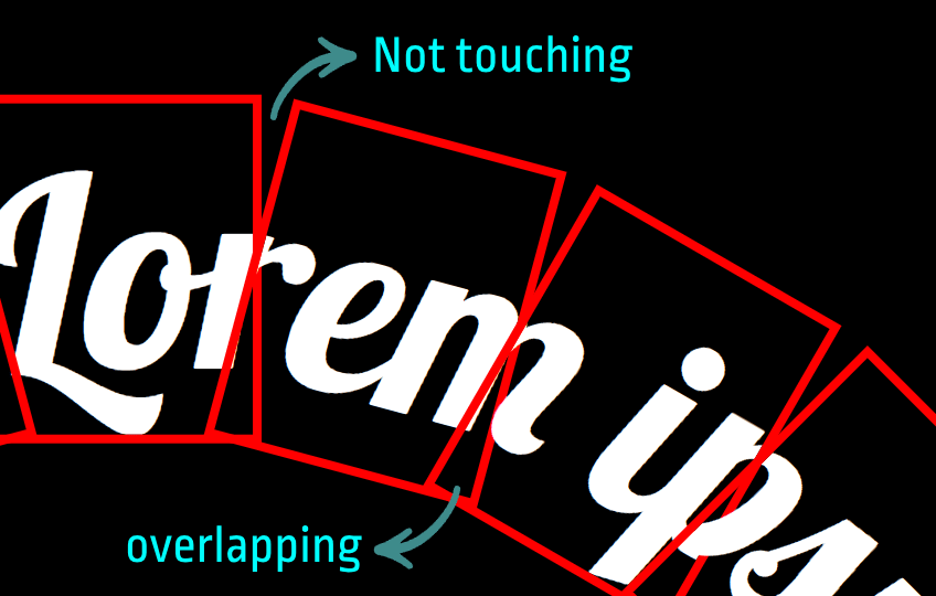
This is of course not what we want, we want these segments to connect smoothly and seamlessly. This is where the magic happens!
Step 3) Perspective
In order for these rectangles to connect seamlessly they actually shouldn’t be rectangles, but some sort of trapezoids. Wider at the top and thinner at the bottom than the original rectangle. In CSS, when we want to make a trapezoid out of a rectangle, most of the time we will use a clip-path or a mask, but that won’t be ideal in our situation as we might clip out (or mask out) important visual information of the text itself.
What we need to do is to ‘stretch out’ the top part of each segment and ‘squeeze in’ the lower part, so that the segments will connect as they should without us losing any visual information of the text. And we can actually do it using perspective.
The most basic thing about perspective is that things that are closer to us look bigger, and things that are farther away from us look smaller. So we can utilize perspective, rotate the segments in a way that the top part would be closer to us (and look wider), and the bottom part would be farther away from us and would look smaller.
To do that, we will add the perspective property on the text container, and then all we need to do is to rotate the segments on the x-axis 90deg towards us.
.textContainer {
  perspective: 15em;

  span {
    transform: rotateX(-90deg);
  }
}Code language: CSS (css)
Adding this to our previous code will result in a seamless connection between the segments and a continuous text, regardless of the type of font you’re using. (we’re going to talk about the value of the perspective in the next part)
So what’s really going on?
Although it doesn’t seem like it right now, what we’ve created is actually a ring of flat elements, but because we’re looking at it from a specific perspective and don’t have visual context to compare it with, it looks like the ring is flat.
To help us understand it better I’ve created this animation:
As we can see, we didn’t actually transform the rectangles into trapezoids, they are just arranged one next to the other. But because we are looking at them from a specific perspective, where the top part of the rectangle is closer to us and the bottom part is farther away, it looks like they are trapezoids.
The distance at which we’re looking at the ring (that is, the value of the perspective) determines the shape of the trapezoids, so if we set the perspective to a lower value the trapezoids would look longer, and if we set it to a higher value it would look smaller. So it’s a bit of a game of trial and error to find the right value for the text to look nice.
Can’t SVG do this?
It’s true SVG has a relatively straightforward <textPath> element that was designed for setting text on curved paths. The unfortunate part is that it is still based on splitting the text into individual characters, so while we’re no longer limited to monospace fonts, cursive fonts will still look broken. See:
Final Touches & Animation
Now we can get rid of the red outline to get a continuous text, that was just a fun visual aid. Sadly, this may result in some thin gaps between the segments (hairlines), but there’s a very easy fix for that. All we need to do is to bring those segments a bit closer to each other, and for that we need to adjust the translateY function in the transform. In this case I’ve added 0.1em as it’s more than enough.
translateY(calc(-1em / sin(15deg) + 0.1em))Code language: CSS (css)To add some color to our text, there’s a few methods we can use. We could simply set the color property on the text container to have one solid color, or we can make it more colorful by utilizing the --i custom property to set a different color for each segment. For example:
span {
  color: hsl(calc(var(--i) * 15) 100% 50%);
}Code language: CSS (css)
We can also use a background-image on the span elements and use the background-clip: text method if we want to get something more complex.
And as for the animation, here I’m using a relatively simple rotation (I’m adding a bit of a ‘fake skew’), but in fact we are only limited by our own imagination, and we can add whatever animation we want on the text container.
The final result of what we’ve built so far looks like this:
If you liked this concept, I’ve done a live stream a few months back where I go much deeper into the whole topic of forced perspective and explain how to create a circular text that is much more responsive and adjustable (and a bit more complicated).
Hope you found this method helpful and maybe learned something new. If you have any comments or have used this on a project somewhere, I’d love to hear them.

many thanks to your great and gorgeous work!
very neat and concise explanations 🙂