Skip to content
New issue

Have a question about this project? Sign up for a free GitHub account to open an issue and contact its maintainers and the community.

By clicking “Sign up for GitHub”, you agree to our terms of service and privacy statement. We’ll occasionally send you account related emails.

Already on GitHub? Sign in to your account

feat(dialog): Ability to present MatDialog fullscreen #10094

Open
asido opened this issue Feb 22, 2018 · 17 comments
Open

feat(dialog): Ability to present MatDialog fullscreen #10094

asido opened this issue Feb 22, 2018 · 17 comments
Labels
area: material/dialog feature This issue represents a new feature or feature request rather than a bug or bug fix help wanted The team would appreciate a PR from the community to address this issue P4 A relatively minor issue that is not relevant to core functions

Comments

@asido
Copy link

asido commented Feb 22, 2018

Bug, feature request, or proposal:

feature request

What is the expected behavior?

An ability to present modal dialogs fullscreen.

What is the current behavior?

Can't present modal dialogs fullscreen.

What are the steps to reproduce?

What is the use-case or motivation for changing an existing behavior?

This feature is in Material design specifications:
https://material.io/guidelines/components/dialogs.html#dialogs-full-screen-dialogs

Which versions of Angular, Material, OS, TypeScript, browsers are affected?

Is there anything else we should know?

@josephperrott josephperrott added feature This issue represents a new feature or feature request rather than a bug or bug fix help wanted The team would appreciate a PR from the community to address this issue P4 A relatively minor issue that is not relevant to core functions labels Feb 22, 2018
@crisbeto
Copy link
Member

You should be able to make a dialog fullscreen by setting its width and maxWidth to 100vw.

@asido
Copy link
Author

asido commented Mar 16, 2018

Width works fine, but the height doesn't.

I forked the "What's your name?" dialog sample, added width and height overflowing content and set maxWidth/maxHeight to 100vw/100vh: See here

The maxHeight is hardcoded in the library to be 65vh. I believe it's due to mobile devices, where 100vh always overflows the visible document?

You can go ahead and set height:100vh, but that will simply stretch the frame, while the content will overflow at 65vh.

@crisbeto
Copy link
Member

That's a general issue with the dialog that'll go away with #9236. Until then you should be able to work around it by overriding it in your CSS.

@jtcrowson
Copy link

Would be nice to be able to configure full screen when width < 600 px (on mobile).

@engineer-andrew
Copy link

I came across this issue while looking specifically for a way to open a dialog full screen only on small devices. This seems like something that gets asked a lot so I wrote a blog post about it and provided my solution there.

Essentially what we can do is resize the open dialog when the device size changes by using the BreakpointObserver class. You have to know the size you want to use on large screens, but other than that I haven't found any problems with it.

Hope this helps someone else.

@jtcrowson I think what I wrote up solves your problem and it's pretty easy to implement.

@simeyla
Copy link

simeyla commented Jul 6, 2018

@jtcrowson Here's my solution

First of all - as an aside - we need to stop using 100vh. Forget it even exists for the purposes of dialogs. It flat out doesn't work well on mobile devices with toolbars that hide once you start scrolling and can correspond to a height that's taller than the actual visible viewport. What's great about the overlay API is it sticks everything in a DIV anchored on top of the whole site, so using calc(100% - 2em) works very well.

What I'm doing is taking advantage of the fact that MatDialog allows you to add css classes for the overlay and panel. When you open a dialog you add these parameters to 'options':

    {
            backdropClass: 'logindialog-overlay',
            panelClass: 'logindialog-panel'
    }

Then the following css is used to change the size of the dialog when on mobile and make it fullscreen.

.logindialog-overlay
{
    .mobile &
    {
        background: black;
    }
}

.logindialog-panel
{
    .mobile &
    {
        // important is used because MatDialog applies css to the elements
        max-width: none !important;
        max-height: none !important;
    
        width: calc(100% - 2em) !important;
        height: calc(100% - 2em) !important;
    }
}

You can choose to just use media queries to enable this (and remove the .mobile class) - but this is Angular and we're smarter than that and we're probably using something like Anglar Flex Layout

So what is .mobile you are probably asking? Well it's a class that I am applying to the overlay container element - so as to give me a 'modernizr' style css parent class I can then 'consume'. I do this inside my LoginDialogComponent.


    constructor(
        public dialogRef: MatDialogRef<LoginDialogComponent>,
        private renderer: Renderer2,
        private smartLayout: SmartLayoutService,
        public overlayC: OverlayContainer,

        @Inject(MAT_DIALOG_DATA) public data: ILoginDialogData) {

            // reference to container element where the overlays get added to
            const overlay = overlayC.getContainerElement();

            smartLayout.getObservable('mobile').subscribe((isMobile) => {

                if (isMobile){
                    renderer.addClass(overlay, 'mobile');
                } else {
                    renderer.removeClass(overlay, 'mobile');
                }
            });
    }

SmartLayout is my extension to FlexLayout that uses MediaMonitor to monitor for changes to media queries.

@nicoraffin
Copy link

Here's my solution. What about a PopupService?

------------------ popup.service.ts ------------------

import { Injectable, TemplateRef } from '@angular/core';
import { Breakpoints, BreakpointObserver } from '@angular/cdk/layout';
import { MatDialogRef, MatDialog, MatDialogConfig } from '@angular/material';
import { ComponentType } from '@angular/cdk/portal';

@Injectable({
providedIn: 'root'
})

export class PopupService {

constructor(private dialog: MatDialog, private breakpointObserver: BreakpointObserver) { }

matDialogRef: any;
smallDialogSubscription: any;

open(componentOrTemplateRef: ComponentType | TemplateRef, mobileWidth: string, data?: MatDialogConfig): MatDialogRef {
if (data) {
data.maxWidth = '100vw';
data.maxHeight = '100vh';
}

this.matDialogRef = this.dialog.open(componentOrTemplateRef, data);

this.smallDialogSubscription = this.breakpointObserver.observe([Breakpoints.XSmall, Breakpoints.Small])
.subscribe(size => {
if (size.matches) {
this.matDialogRef.updateSize('100%', '100%');
} else {
this.matDialogRef.updateSize(mobileWidth, 'auto');
}
});

return this.matDialogRef;
}

close(): void {
this.smallDialogSubscription.unsubscribe();
this.matDialogRef.close();
}

}

--------- account.component.ts --------

...
editAccount() {
this.popupservice.open(AccountEditComponent, '800px', {
data: {}
});
}
...

--------- account-edit.component.ts --------

...
close() {
this.popupservice.close();
}
...

Based on this blog

@Tibo46
Copy link

Tibo46 commented Jan 2, 2019

You can do it in pure CSS
.cdk-overlay-pane { width: 90%; height: 90%; } @media(max-width: 1000px) { .cdk-overlay-pane { width: 100%; height: 100%; } }

and just don't put the width and height when instantiating your modal (you can pass max width and height)
const dialogRef = this.dialog.open(AvailableRoomsComponent, { maxWidth: '100vw', maxHeight: '100vh' });

@aehven
Copy link

aehven commented Feb 6, 2019

I got it working with this in css:

.cdk-overlay-pane {
  max-width: 95vw !important;
}

But then I still have to add size to my dialog creation to take advantage of that:

let dialogRef = this.dialog.open(MyDialogComponent, {width: '100vw', data: {blah}});
@makamekm
Copy link

It works using:

const dialogRef = this.dialog.open(AvailableRoomsComponent, {
  minWidth: '100vw',
  height: '100vh'
});
@kjdeepak
Copy link

@makamekm Awesome. You saved my day! This technique works perfectly.

@wutzebaer
Copy link

wutzebaer commented Feb 3, 2020

just wanted to drop my workaround-hack, in case the above doesn't work for you, like me, i used the mat-content tag to keep my buttons in view

  .cdk-overlay-pane {
    max-width: none !important;
    flex: 1 1 100%;
    height: 100%;
  }
  .mat-dialog-content {
    max-height: none !important;
    flex: auto;
  }
@phrei
Copy link
Contributor

phrei commented Apr 8, 2020

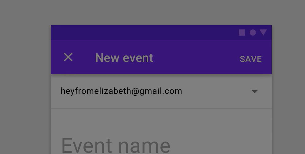
It's a good workaround but it's not really a full-screen dialog as specified by Material Design - (find "Full-screen dialog") i.E. the closing "X" on the top left and "save" button on the top right.

@Wildhammer
Copy link
Contributor

The workarounds only take care of the size, the action buttons layout is different in the material guidelines. They are at the top.

Screen Shot 2020-05-05 at 2 29 31 PM

@faan11
Copy link

faan11 commented Sep 6, 2020

For my project, I did this feature module to manage dynamic dialog layout.

The module has four functions:

  • openCenterFull: Open dialog with desktop (vertically and horizontally centered), and mobile (full width and height)
  • openCenterBottom: Open dialog with desktop (vertically and horizontally centered), and mobile (bottom, like bottomSheet )
  • openRightFull: Open dialog with desktop (right with full height ), and mobile (fullscreen)
  • openLeftFull: Open dialog with desktop (left and full height), and mobile (fullscreen)

If you only need to present the dialog in fullscreen mode, you can search in the first two functions.

https://gist.github.com/faan11/7eb04a23e6d63d1a0a95260c8211dec5

@Char2sGu
Copy link

As the dialog component in Angualr Material Experimantal has adopted the implementation from MDC, where full-screen dialog is available, I believe it is super easy for the team to implement this feature, but they didn't 😕.

@jpike88
Copy link

jpike88 commented Dec 19, 2022

I don't understand how this wasn't implemented from the beginning. Who wants to look at a tiny box inside a tiny box, which is their mobile phone screen? Doesn't it make sense to place dialog buttons down the bottom centre in a vertical row for people to easily use their thumb, instead of stabbing around the middle of the screen?

For all of the effort poured into Material Design these kinds of considerations seem so basic, and I still have to twist the dialog's styling and button placement to achieve some basic usability standards.

Sign up for free to join this conversation on GitHub. Already have an account? Sign in to comment
Labels
area: material/dialog feature This issue represents a new feature or feature request rather than a bug or bug fix help wanted The team would appreciate a PR from the community to address this issue P4 A relatively minor issue that is not relevant to core functions