-
Notifications
You must be signed in to change notification settings - Fork 3.4k
Conversation
|
See #1120 |
|
As requested popover created based on mdTooltip |
|
Sorry, my bad! 👎 for me |
|
@stevenh77 - This is looking good. I do not see your demo using the |
|
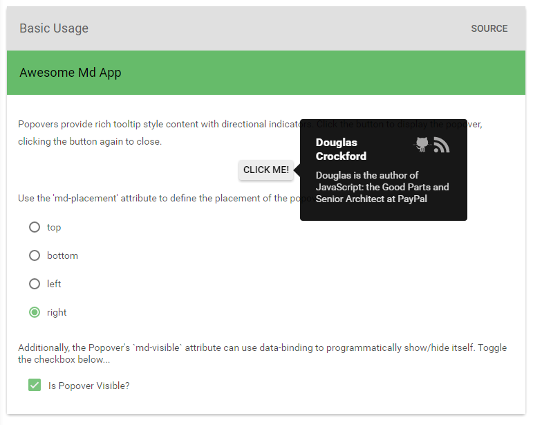
@ThomasBurleson I've added md-placement along with some rich content (an image) and updated the demo, what do you think? |
| function setVisible(value) { | ||
| setVisible.value = !!value; | ||
|
|
||
| if (!setVisible.queued) { |
There was a problem hiding this comment.
Choose a reason for hiding this comment
The reason will be displayed to describe this comment to others. Learn more.
$mdUtil has a debounce method. Maybe it could be used instead of custom debouncing.
There was a problem hiding this comment.
Choose a reason for hiding this comment
The reason will be displayed to describe this comment to others. Learn more.
As requested the popover has been created in the style of tooltip. Perhaps the $mdUtil could be refactored across all components?
|
Ok, ready for you guys to take a look, thanks @gkalpak @ThomasBurleson |
|
@stevenh77 - I will look at this later today.
|
|
@ajoslin - later, let's you and I review this new component and discuss impacts. |
|
It's a bit hard to fully evaluate without forking and building your branch, but the popover content needs to be semantically associated with its trigger button. The bootstrap version uses |
|
@marcysutton It's based on tooltip but sure I can add that |
|
@marcysutton ah just checked and it's already there. You can run my docs here: http://stevenhollidge.com/docs/#/demo/material.components.popover Or view the aria-described by here: |
|
A couple things:
|
|
@marcysutton I was asked by @ThomasBurleson to differentiate the popover from a tooltip but I'm happy to set it's role to tooltip if that's the spec. The popover is just a container for whatever content the developer wants to display, in my demo example I happened to display a SVG. I saw the contents aria attributes as being the responsibility of the developer who sets the content, is that how you see it? |
|
My comment about ARIA roles was because I do see setting the contents as a responsibility of the developer. But in Angular Material, we warn them when they have forgotten text content....otherwise they'd never know it was an issue, and we'd be contributing more accessibility issues on the Web. By using the |
|
Ok cool, is there an example of using the mdAria utility? Sounds like it needs to be applied to the tooltip as well. |
|
@stevenh77 - this is looking really good. I only have two (2) summary points:
|
|
@ThomasBurleson to save me recreating the code do you have the HTML you used for your mockup or was it generated using graphics software? |
|
@stevenh77 - The image above was a snapshot from FrontEnd Masters; but it nicely highlights Popovers with rich content: <div class="master-tooltip master-tooltip-top">
<div class="wrap">
<p class="links">
<a href="https://github.com/douglascrockford" class="github">github</a>
<a href="https://en.wikipedia.org/wiki/Douglas_Crockford" class="wikipedia">wikipedia</a>
<a href="https://plus.google.com/118095276221607585885/posts" class="blog">blog</a></p>
<p class="large-name">Douglas Crockford</p>
<p class="bio">Douglas is the author of <em>Javascript: the Good Parts</em> and Senior Javascript Architect at PayPal.</p>
</div>
</div> |
|
@ThomasBurleson demo updated with rich content: |
|
@stevenh77 - really nice work.
|
|
Let's hope they give it the nod after all this ;) |
|
This is looking great! We should think through accessibility a bit more, though, because I imagine people will continue using it regardless of whether it gets accepted by the UX team. :) When an element has links and content inside of it, keyboard and screen reader users have to know they're there and be able to access them. This is where a tooltip and popover start to differ–the popover may have too much content to put in an |
|
Hi @marcysutton escape key to close popover has now been added. The dialog component when opened sets it's close button to focus. so if the UX team do ask for a close button to the added to the popover, the focus will also have to be updated accordingly. |
…md-content section, which fixes scrolling issue.

docs(popover): change popover content to make smaller.
|
👍 Really good job man! How can i use it? why it's not a part of material? |
|
For a popover to blend in with Material Design, it needs to do a few things:
We talked about adding a service for point of origin animations, but there wasn't enough demand. You can read about it in the spec: http://www.google.com/design/spec/animation/responsive-interaction.html#responsive-interaction-material-response Were a popover contributed that aligned more with Material Design, it would be a better candidate. |
|
Just update mdDialog to provide optional placement of the dialog. There is plenty of guidance in the material design guidelines to support this functionality. Demo: Source: |
|
@itsleeowen, please note that the Dialog zoom animation has changed significantly in master. Would you mind integrating your enhancements to work with the code in the latest master code base and then submitting a PR? @stevenh77 - I worry that I never thanked you for your amazing work. I would still like to campaign to get your features into AM... |
|
Any news? |
|
Would anyone like to collaborate to get this finished and pulled? Ping me. |
|
Any update on this? Would be a nice addition to Angular Material. |
|
@volmerf this won't be supported and can be implemented using our Panel api |


No description provided.