Heading
Heading defines the hierarchical structure and importance of the content they contain.
On this page
On this page
Usage
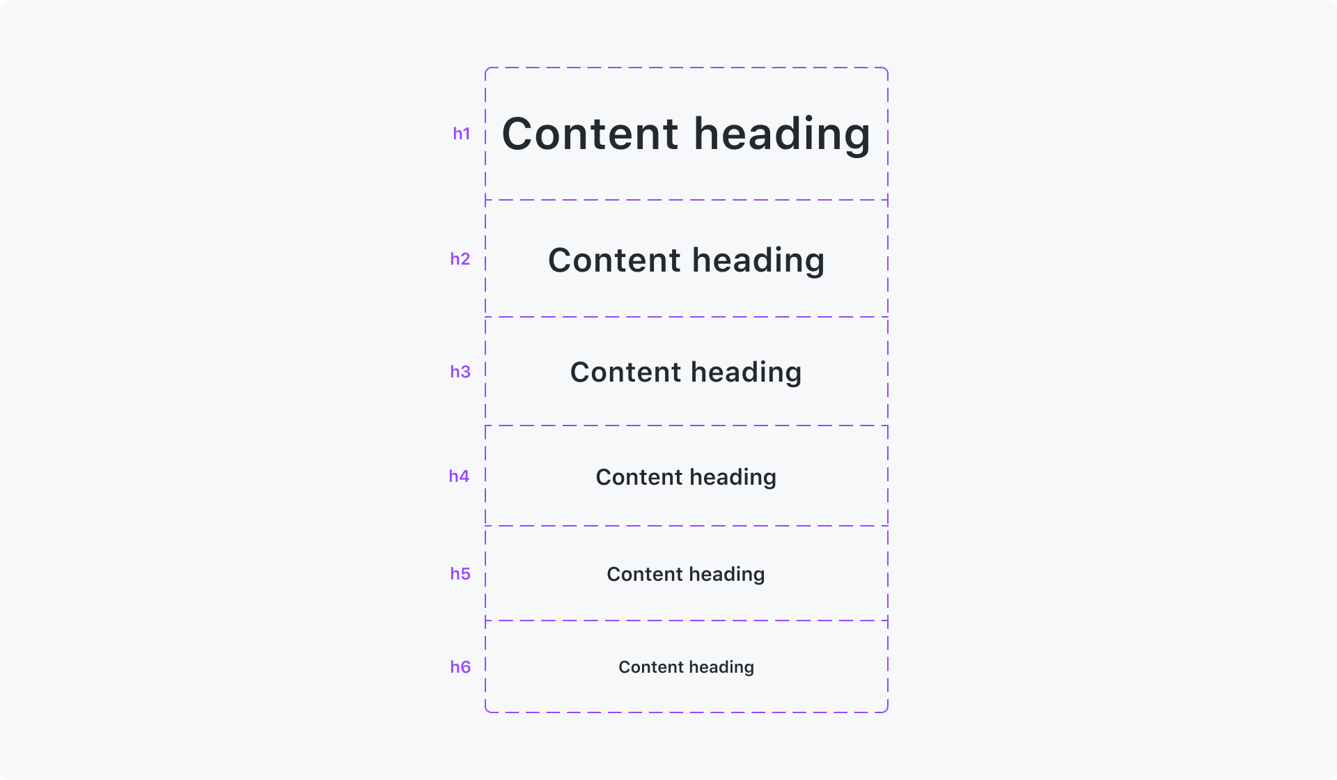
Headings are used to structure the content on the page, with each heading representing a different level of importance. It is recommended to use headings in a logical manner to create a clear hierarchy and improve accessibility.
- Heading should be used to communicate page organization and hierarchy.
- Use heading as the title of a section or sub section.
- Do not use heading for styling alone. For simply styling text, use text with relevant styling.
The heading component will render an html h2 tag without any default styling.
Accessibility and usability expectations
A heading is used to provide a description to the section of content that follows it. There are, therefore, a number of expectations for the accessibility and usability of headings:
- The text of the heading is descriptive of the content that follows it.
- All content associated with the heading follows it in the document source order. While content may be visually styled to appear before the heading, for example a tag that provides categorisation or other content, it should be placed after the heading in the document source order.
- Overall, heading levels must reflect a logical, page-wide hierarchy, similar to a book table of contents. If the content related to a heading includes further sub-headings, these must hierarchically be at least on level deeper. Ideally, no heading levels should be skipped. For example, an
<h2>should be followed by an<h3>. However, there may be situations where this is not possible (generally, when content is included/embedded dynamically) – in these cases, it is acceptable to skip levels, as long as the sub-headings don't have the same or higher level as their logical "parent" heading.
When using a heading, the level of the heading must be appropriate for its place within the structure of the document, and this should be annotated in designs when possible.
While sighted users rely on visual cues such as font size changes to determine what the heading is, assistive technology users rely on programatic cues that can be read out. When text on a page is visually implied to be a heading, ensure that it is coded as a heading. Additionally, visually implied heading level and coded heading level should be consistent. See WCAG success criteria: 1.3.1: Info and Relationships.
Headings allow assistive technology users to quickly navigate around a page. Navigation to text that is not meant to be a heading can be a confusing experience. Learn more about best heading practices (WAI Headings).
Built-in accessibility features
The heading component exposes both the heading role and heading level.
The heading component provides styles with appropriate text sizes to provide a visual hierarchy when the appropriate level is set.
The default heading text has sufficient color contrast against a white background.
Handling subheadings, eyebrows, and straplines
Eyebrows are "subheading" treatments, where the heading text's visual treatment includes a word or phrase placed above or below the main heading in a smaller font size.
Eyebrows should be incorporated as part of the heading element, and have their visual styling modified via a span element applied to the eyebrow word or phrase. Primer typography utility styles can be used to accomplish this.
<h2><span class="h4 lh-condensed text-uppercase">Eyebrow</span>Heading</h2>
Straplines are short pieces of text that are used to augment and provide additional context or information about the heading. They augment the heading content, but are not necessary for understanding. Because of this, the strapline content is not included in the heading element.
A parent landmark element must be used to communicate the programatic association between the heading and its strapline.
<header><h2>Heading</h2><p>Strapline</p></header>
Implementation requirements
When using the component, configure it with the heading level provided in annotated designs or with the appropriate level for the structure of the document and content. It should be noted that the visual design may not always match the annotated heading level, and the annotation should always supersede the visual in the implementation if they differ.
How to test the component
Integration tests
- The text of the heading is descriptive of the content that follows it.
- The heading is of the appropriate level for the structure of the document and content.
- The heading is followed by content related to the heading or a heading of one level deeper.
- All content that relates to the heading follows it in the document source order, even if it appears visually before the heading.
Component tests
- The component exposes the heading role.
- The component exposes the heading's level.